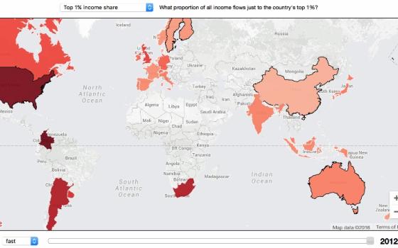
Screenshot of interactive map of migration by Carnegie Mellon's CREATE Lab.
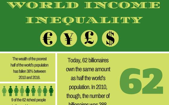
Infographic created by Georgia Perry using Canva with data from Oxfam.

by Georgia Perry
Last month Oxfam released a report, which revealed that 62 people own as much money as the poorest half of the world's population combined. (For the record, that's 3.6 billion people.) Oxfam calls this gaping disparity the creation of "runaway inequality" in the world, and has urged world leaders to take action in the form of "cracking down on tax dodging, increased investment in public services, and action to boost the income of the lowest paid," according to an Oxfam press release.
The gap has been widening steadily over the years as the number of people at the top has been shrinking to a smaller and smaller pool of uber-rich (billionaires). At this rate, the gap will continue to widen; a big difference can even be seen between last year and this year.
Our #3Stats this week looks at some of the most enlightening statistics from this new study, and the very relevant — if a few years outdated — map uses color coding to show what proportion of a country's income flows to the top 1 percent. When you click over to the map, press the "play" button at the bottom to watch how this trend has changed between 1920 and 2012, the year the map was created.
[Georgia Perry is a freelance writer based in Oakland, California. She's contributed to several print and online magazines including, The Atlantic, CityLab, Portland Monthly Magazine and the Portland Mercury. She was formerly a staff writer at the Santa Cruz Weekly in California. Follow her on Twitter @georguhperry.]