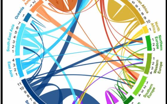
Screenshot of interactive map of migration by Global-Migration.info.
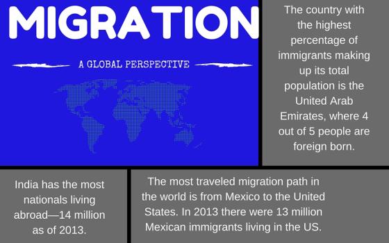
Infographic created by Georgia Perry using Canva with data from Realtor.org/articles/10-facts-on-global-migration.

by Georgia Perry
Migration has been a big issue in 2015. Whether it’s the migration of Syrian refugees to places like Europe and Canada, effects of climate change presenting Pacific Islanders with threats of relocation, or talk of Donald Trump building a wall along the souther border of the US, the movement of people has been on most of our minds in some way or another this year.
That’s why this map, created by folks at the Wittgenstein Centre for Demography and Global Human Capital, is so fascinating. It shows migration flows between and within regions for five-year periods, from 1990 to 2010. (And as a special holiday bonus, it totally looks like ribbons used to wrap packages.) In accordance, our 3 Stats this week are dedicated to migration, with figures taken from United Nations Population Division data from 1990-2013.
[Georgia Perry is a freelance writer based in Oakland, California. She's contributed to several print and online magazines including, The Atlantic, CityLab, Portland Monthly Magazine and the Portland Mercury. She was formerly a staff writer at the Santa Cruz Weekly in California. Follow her on Twitter @georguhperry.]